Thursday, March 8, 2012

Spongebob Philosophy-Pants

Just as scholars break down classic works of literature in order to further explore the themes and symbolic messages hidden beneath the writer's carefully crafted words, I too enjoy analyzing things in order to discover their inner meaning.

Of course, since I myself do not have any kind of Master's degree in overanalyzing the works of masterminds like William Shakespeare or Edgar Allen Poe, my lowly theories on their works would mean practically nothing to the mighty college graduates above.

But why is it that they only choose to read into classic literature when it has clearly been done to death? Why aren't these scholars analyzing more modern things? Are all modern things really that brainless and stupid or is it possible that even the almighty scholars, amidst all their cognitive glory, haven't even considered such a thing?

Well I say if the professionals won't do it, I will have to do it myself.


Digging Deeper With Nick Lives: The Truth Behind Spongebob


Ah, Spongebob. So many of my childhood years you have provided me with near-mindless entertainment. Now here we meet again, but this time, under a more intellectual light. Spongebob is a funny little invertabrae, there's no doubt about that.

 But is that really all he is? Is Spongebob merely an absorbent goofball with no deeper meaning driving his actions or appearance? Or is it possible that he, along with his other fishy friends, is a very intelligently crafted character whose traits all help form a symbolic representation of something more?

To start, let's take a look at Spongebob's most prevalent feature: his appearance.

Looking at Spongebob, we notice a couple of basic things about his appearance:

1. He is yellow.


2.He is square.

So what can we take away from this? Well for starters, the color yellow (in western culture) symbolizes things like sunshine, happiness, and joy, which seems to fit Spongebob's character pretty well. Although yellow is also often used to symbolize illness, decay, and age.

As for which symbol Spongebob's yellow is supposed to represent, we can't say for sure. Perhaps some of Spongebob's other features will be more revealing.

Next we notice Spongebob's obvious square shape. Although he himself isn't a perfect square per se, his name implies that he is indeed a square, despite any inconsistencies the animators may have with the shape.

Now in geometry, a square is defined as a regular quadrilateral with four equal sides and four right angles. The number four being so prominent here, I looked into some interesting facts about four that would help us better understand Spongebob's form.

"In China, 4 is unlucky because "she" (four) and "shi" (death) sound similar."

Death, huh? Fascinating. Perhaps then, Spongebob's yellow flesh represents not sunshine and happiness like it may first seem, but instead represents decay, age, and illness, as those are things more likely to be related to the symbolic "death" of his square shape.

Oh yeah, and just in case that little China fact didn't win you over the "square = death" theory, it should interest you to know that squares are also often affiliated with the shape of a cross. You know, a CROSS, that thing those people famously crucified that one guy on that one time long ago? Oh, what was his name again?

So now we know that Spongebob's famous yellow square design symbolically represents death, decay, and possibly illness. Where do we go from here?

Next stop: Spongebob's Lifestyle

To be continued when I've had some more time to think about this...

Tuesday, February 14, 2012

Dance Parties are Silly Willy

Sometimes I feel as though I'm the only sane person left on the planet. Tell me, what exactly is the appeal of paying $5.75 for the privilege to jump up and down in a dark room with flashing lights that's filled to the brim with clumps of sweaty assholes? If you answered with anything other than: "Nothing! that sounds terrible," you are officially psychotic.

But hey, let's play fair here. Maybe I'm simply not hip enough to understand the appeal of dance parties. Perhaps, in some way, my nerdy nature has caused me to dislike all things deemed "cool." So that being said, let's see what sorts of things other, less nerdy people, love about dance parties.

The following is a series of "tips" on how to get the most out of a dance party. This article was written on a wiki and was edited by people with user names like "Rafabemerguy" and "Zareem," which both sound like dumb "rapster" names a couple of dumbass teenagers might give themselves; so I'd say we got a pretty reliable source here. Tell me oh mighty rapsters, how DO I have fun at a dance party?

-Have Fun! 

Well no shit. Here I was thinking that the only way to have fun was to try and NOT have fun, but you've certainly shown me the light, Mr. Awesome guy. But I still wonder: what other things BESIDES HAVING FUN must one do to have fun at a dance party?

-Dance for every dance even though your not good enough or don't know what to do.

This right here is the problem with society. People doing things regardless of whether or not they are actually talented. Why should I dance if I suck at it? Oh, and for the record: if "jumping up and down while waving your hands in the air" counts as dancing, then me vomiting on your new rug should count as abstract art.

-Get some of your friends and dance together.

 How does one dance "with" someone anyway? I mean when it comes to the classic ballroom stuff, it's clear that they're dancing with one another because they are literally holding hands and dancing in unison. But when it comes to the type of dancing people do at dance parties, dancing "together" seems to simply mean "dancing within roughly the same vicinity of one another," which is stupid because it always means that one of you or your idiot friends are bound to eventually swing one of your arms too wildly and smack someone in the face. Everything's better in groups, right? I suppose pain applies to that rule as well.

-Ask someone to dance when it is a slow song! You don't want to look like a loner/something else when everyone else is slow dancing.

I think whoever added this in to the wiki might have gotten "dance parties" confused with "school dances," because I can't remember the last time a dance party DJ started playing "Can you feel the love tonight."

-REMEMBER if you want to do anything embarrassing then get your friends and do it together so you all get embarrassed! (Not just one person.)

Once again, this goes along with the mentality that everything is done better in groups. "Hey guys! I have a totally awesome idea! Let's go hurl ourselves out a third story window! But for safety, let's do it together so we won't embarrass ourselves individually." The ironic thing about this tip is, if you and your friends are all at a dance party together in the first place, then congratulations, you're already embarrassing yourselves.

-If someone rejects you don't spaz or get mad just keep being happy and just continuing dancing with your friends and try to avoid that person for the rest of the party so you don't have to deal with them.

Yeah, 'cause that's how adults handle their problems, by avoiding them completely. This little tip is supposedly connected to the previous tip about making an idiot out of yourself, except this tip deals with the consequences of such an action. Maybe people wouldn't "reject" you so much if you weren't purposefully acting like an idiot the whole time. Also if the word "spaz" is still in your vocabulary after you've graduated from Middle School, you deserve to get a dictionary shoved up your nostrils.

-Don't worry but the guy/girl cause they might be your Boyfirend/Girlfriend
  
This is barely a coherent sentence, let alone a good tip about how to have fun at dance parties. I shouldn't worry about guys or girls because they might be my boyfriend or girlfriend? What the hell does that mean? If this is the kind of stuff people worry about at dance parties, I want no part in that shit. 

That is all I have to say on the subject for now. Check back here when I think of more things to rant about.

Saturday, September 10, 2011

Dead Creativity

So with the recent release of yet another zombie game, "Dead Island", I've noticed a naming trend in this whole zombie genre that I honestly feel stupid for not noticing much much earlier.  See if you can figure it out.

Notable Zombie-Related Titles:

Left 4 Dead 


Dead Rising


Dead Space


Dead Island 


Notice anything similar?  Seems to me like the naming committee for zombie titles these days just have to write the word "dead" on a piece of paper, and just pretty much see where it goes from there in order to get the final title.

Not to simply end this article with a stupid observation countless people have most likely made already, I found another less-obvious connection between these similarly named games. Despite what may be implied in their titles, none of these games actually feature the classical "walking dead" type zombies.  The zombies featured most prominently in Romero's "Night of the Living Dead" films were literally supposed to be WALKING CORPSES!  Thus, the only zombies that can be classified with the word "dead" in the name are these type of zombies, which are all noticeably absent in every single freakin' title listed above!

Instead, they give us these shitty "modern" zombies, who are all just regular people with some advanced form of rabies, alien virus, or some other form of infection.  None of which, I might add, are terminal.  So not only are these zombie-game titles cliche and uninspired, but they are just downright LIES!  If you're not going to feature any DEAD zombies in your videogame, then don't go around putting DEAD in the title.  It's not like titles are hard to come up with anyway.  Hell, I could come up with much better, much more TRUTHFUL titles for all these games off the top of my head.  Ready?

GO TRUTH MACHINE!


Left 4 Pissed-Off Rabies Victims


Mutant-Wasp-Larvae Rising


Alien-Virus-That-Turns-You-Into-Mutant-Bugs in Space


Pissed-Off Rabies Victims (Again) on an Island


Now you know the truth.  And knowing is half the battle.

Monday, August 22, 2011

Developing a Character

So for those of you who don't know, (and if you read my blog you probably already know me in person, so you SHOULD know by this point anyway) I consider myself a bit of a cartoonist.   This meaning I draw cartoon characters.  A LOT. 

So for the hell of it, I decided to go over what goes into creating an awesome cartoon character by showing you folks how it's done.  Without further ado, let's do this!

CARTOONING WITH NICK


So to begin, let's come up with what we wanna draw.  After opening up my faithful "ToonBoom Studio", I decide I want to draw an adorable little bunny wabbit.... wearing a gas-mask.  Why the hell not?


As you can see here, the first thing I do once I have my idea set is draw the basic shapes that will make up the character.  As you can see I usually draw this framework in a light blue color, so I'll be able to distinguish it clearly from the complete drawing once I begin building it over this drawing layer.


Now I've added the basic framework for the whole bunny rabbit.  Ears, little bunny paws, even the basic gas mask overlay.  It's all here.  Now comes the fun stuff...


NEW LAYERS!  Every element in my characters usually comes with its own layer.  As you can see here, our first goal will to create the bunny rabbit's head.  Some cartoonists may start with the body and whatnot, but I tend to start with my character's heads because they're more fun.


After looking up a few reference photos of what a typical gas mask looks like, I begin to build up a more defined mask for our bunny wabbit to wear over his face.  Since this is technically part of his head, I won't create a separate layer for the mask this time.


Adding the fine details to even simple things like the wrinkles on the bunny's mask always makes for a better looking picture in the end.  So let's add a few of those for good measure.


Now we're starting to build the ears on our character.  You may have noticed at this point that I have changed the outline color for the ear portions to a dark gray as opposed to black.  This helps to make the character look less like a jumble of black lines and more like an actual character.  Although this is simply a matter of personal taste.  I'm also beginning to thicken the lines around the ears, to better define their outline.


Now we start the colorizing process.  The first time we color we won't worry too much about shading, so we'll just paint bucket the big stuff first with our most basic palette.


I thought the bunny's eyes looked kind of weak with just simple black lenses for his gas-mask eyes, so I decided to give him some bad-ass red lenses instead.  Oh yeah and I threw in some temporary light reflections in his lenses for good measure.


Let's make sure our bunny can breathe, so let's give his mask a few of those gas-mask breathing holes.  Details details.


Moving on from the head, I'll start fleshing out some of the other body parts as well.  So let's add some little bunny arms.  But wait what's this?  Something about the joints in our bunny's arm looks odd.  Could it be that the lines are too consistently thick and thus it looks kind of funny?  Well let's fix that with some good old fashioned line sharpening shall we?


Now that looks better doesn't it?  This little trick usually helps the drawing look less flat, and gives joints and corners a little more edge.  I achieved this by simply erasing some corners off the edge of certain lines.  Now that that's done, let's move this drawing along shall we?


Repeating the process of drawing, sharpening, and colorizing, we finally have ourselves a fleshed out version of the bunny rabbit framework.  Now we just have to- hey wait a second, something is wrong here, why doesn't the bunny have a tail?  Did I forget to draw one onto the framework bunny?  Well shit let's fix that!

30 Seconds Later...


There we go, NOW the bunny is complete.  Nobody said I was perfect.  Now then, let's begin the next phase: adding a bad-ass background for our bad-ass bunny.


BAM!  Now how's THAT for a bad-ass background?  Relatively simple yes, but effective and fitting for our little furry friend here.  But we're not quite done yet, because now comes the wonderful process of SHADING and OUTLINING to define the bunny's features and create a stronger focal point.


First- the outlining.  While it may not seem terribly important, outlining our character usually helps make him stand out more against the background.  You may have noticed I used a similar method with my Hitler vs. Mickey picture, in order to highlight the characters against the zany orange background.


And now for the shading.  By far the most tedious process, I usually put on some music at this point to make things go by faster.  Unfortunately something was going on with my iTunes at the time, so I suffered through this lovely process in silence.


Several tedious minutes later, I finish the basic shading and decide to open up a new layer in order to add some cool "scratches" around our bunny fellow, to give him a little more depth and edge.  You may notice the shading is not visible here, that being because I hid the layer momentarily in order to scratch him up.

And FINALLY...


HE IS COMPLETE!  After some final tweaking to the black background to give it more of a "glow" effect, I sign the picture and export it into a .png file!  For comparison to how this whole thing started out, I also exported a version of Gas-Rabbit with only his framework in tact.  Big difference eh?


Oh Gas-Rabbit, how you've grown...

Well that's it.  That's my magical cartoon-making process.  I hope this has been interesting and perhaps helpful. Until next blog post, peace out bros and gals!

Sunday, August 21, 2011

Hitler vs. Mickey Mouse

Today has been incredibly boring and exhausting, so I do believe it's about time I let my imagination run free and write about something a little less mentally straining than some of my other posts. So....

WHO WOULD WIN IN A FIGHT TO THE DEATH?

ADOLF HITLER                                               OR                                             MICKEY MOUSE?


Let's find out!


CHALLENGE 1: Leadership Abilities

   ADOLF HITLER:                                                                                  MICKEY MOUSE:

  Led an army of Nazis and took over                                             Led an army of animators and
  various European countries.                                                     took over nearly the entire world.

WINNER: Mickey Mouse.

Sure maybe Hitler led massive armies and took over nearly all of Europe, but Mickey and his army of followers took over the goddamn world.  Not to mention while Mickey's army continually grows, Hitler's army barely makes the papers these days.


CHALLENGE 2:  Most Evil Deed

ADOLF HITLER:                                                                                        MICKEY MOUSE:

The Freakin' Holocaust.                                                                     The Freakin' Disney Channel.

WINNER: Adolf Hitler.

Mickey may have created one of the most fiendish, corrupting television channels of all time, but Hitler's plan to create a "perfect race" of Aryans by systematically killing all Jews in the world is pretty goddamn evil even by Disney standards.

CHALLENGE 3: Lifespans.

ADOLF HITLER:                                                                                      MICKEY MOUSE:

56 years and then suicide.                                                                        83 years and counting.

WINNER: Mickey Mouse.

Granted, Mickey would normally get this one automatically for simply being a fictional character, but I'm not kidding when I say this mouse is freaking IMMORTAL.  This little dude outlives even most characters from his own field.  Remember Felix the Cat?  No?  That's because Felix the Cat has been dead for nearly 60 years.  His replacement?  The immortalized Mickey Mouse.  'Nuff said.

CHALLENGE 4: Style.

ADOLF HITLER:                                                                                         MICKEY MOUSE:

Sports a black emo haircut,                                                                  Sports an obnoxious smile,
a wee little 'stache, and                                                                           two gigantic ears, and
a Nazi uniform.                                                                                        a pair of red overalls.


WINNER: Neither.

Dressing up as either of these two characters always earns you a firm slap in the face at any costume party.  Seeing as how their both totally lacking in the style department, neither of these guys win this award.  Seriously Mickey, get a new pair of overalls already.  God only knows what kind of stench has built up in there over all these years.

And the Winner is....

MICKEY MOUSE!


Ah yes, so the rodent beats out the German dictator after all.  Who woulda thunk?  Well I would have thunk it actually, since I wrote the article and all, but whatever.  Since there was really only like, three actual challenges for both parties to face, and Mickey beat the mustached man two-to-three.  So there ya have it.  

Not entirely sure what this means though.  Does this mean that since Mickey kicked Hitler's ass, that he's therefore more evil than Hitler?  After all, no one really wound up kicking Hitler's ass in the real world anyway, since Hitler decided to take it like a wuss and shoot himself before anyone got the chance to.  So since I'm at a lack for reasoning, let's just say that this makes Mickey slightly more bad-ass than the pussy Hitler was.  Which I guess is kind of a compliment, in a stupid, nonsensical sort of way I suppose.

Whatever, Mickey wins.  I'm tired.  Have a good day folks.

Monday, August 15, 2011

Winnie the Pothead

So a little while back, I saw the recently released reboot for the Winnie the Pooh franchise, titled "Winnie the Pooh".  It was a cute one hour film and all, and all the characters of the hundred-acre woods were just as I had remembered them as a young child.  But only now did my teenager brain realize a connection between Pooh's obsession with honey, with a pothead's obsession with weed.

And it led to my creating this.  Without further need of explanation, enjoy.  But for the record, this series was inspired by the guys over at Spill.com for first bringing said connection into light.  Just givin' credit where credit is due.  That being said, Enjoy.


Monday, August 8, 2011

Top 10 Most Disturbing Disney Posters

So today whilst sitting on the couch like a sunken pathetic spud, I decided it might be fun to bring back an old hobby of mine:  reading too much into children's movie posters.  So without further ado, I give you my top 10 list of the most disturbing Disney movie posters I could find!  Or to reiterate in bold..

Nick's TOP 10 MOST DISTURBING DISNEY POSTERS!

10.)    "The Shaggy Dog"

JESUS OF NAZARETH!!  The first thing I thought when I saw this abomination was "Oh my GOD, Tim Allen's creepy photo-shopped dog eyes are gazing into my soul!"  Seriously, stare at it long enough and you could swear the eyes start following you around when you move, like those head busts in the Haunted Mansion, but ten times more disturbing.

9.)     "UP"


Now I know many may disagree with me on this one, what with "Up" being one of Pixar's most magical and heartwarming tales, but I can't help but feel a little uncomfortable when I look at this very minimalist depiction of a floating, seemingly empty house, drifting away into the endless void of clouds, never to be seen again.  For reference, take a look at what a few slight alterations do to this seemingly peaceful poster:


Not so peaceful and cuddly now, is it?

8.)   "Beverly Hills Chihuahua"


Now just for the record, I'd like to point out that the file name for this particular poster was "slashfilmdisney".  For those of you who don't know shit about film genres, the "Slasher Film" genre is the one that features lots of stabbing and killing and murdering.  Just thought that was interesting.

As for the actual content of the poster, there actually isn't a whole lot wrong with this one, that is if you discount the hordes of ritualistic Chihuahuas bearing torches behind the two apparant "victims" of the ceremony.  But what really sold it for me on this one, was its blatantly disturbing tagline:
Now THAT sent some shivers up my spine.  What the hell is that supposed to mean?  To imply that there's going to be some sort of uprising against mankind, led by the world's smallest and most edible dogs?  I don't think I want to know.

7.)   "Hannah Montana Concert 3D Thingy"


Aside from Miley Cyrus's presence on the poster, this one too, seems rather innocent.  Upon closer inspection however, I noticed something odd about one of the audience members.  Looking at the audience member directly beneath Miley's pop-star kneecaps, we notice a few things about this person:


1.  He is a dude.

What the hell is a fully-grown man doing at a Hannah Montana Concert?  A place that is undoubtedly full of young, under-age girls with too much soda in their system?  With this information, we can only conclude that..

2.  He is a pervert.

The only explanation for a grown man's presence at a Hannah Montana concert.  Continuing along this string of logic, we notice that his fingers are pointing in such a way, that it almost appears like...

3. He's measuring the size of Miley's Popstar Waist.

What else could he be doing with his fingers protruded like that if he's not mentally measuring the size of his next victim's waist?  Perhaps I read too much into things, but if I'm not, then this is sheer proof of Disney's secret motivation to sell to the pervert demographic.

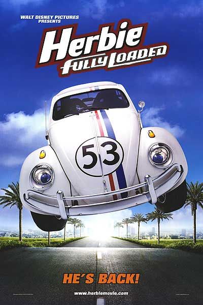
6.)  "Herbie: Fully Loaded"


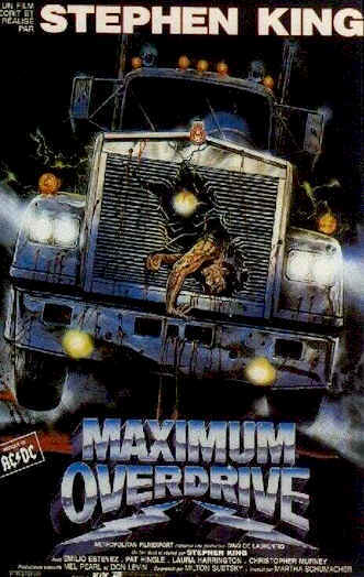
Perhaps it's just me, but the thought of a smiling, wide-eyed Bug pouncing towards me at full speed, does not sit well with me.  In fact, it scares the living hell out of me.  In many ways, this poster reminds me of another, similarly themed horror movie poster.


Looks like pleasant family fun doesn't it?  Take note Disney: Don't steal ideas from crappy horror flicks from the 80's.

5.)   "Aladdin"


At first, this one simply looks very pretty.  It's artistic, minimalistic, everything you could want from a poster.  It simply captures the magical essence of Disney, doesn't it?  Ah yes..the magic of...
WHAT THE HELL IS THAT COMING OUT OF THE LAMP?


Upon closer inspection, we see some sort of face within the glowy mass coming out of the magic lamp.  Here I upped the contrast a bit so you can see it better, but if you still can't see it, I'll outline it for you in red ink:


Now that's messed up.  Am I crazy, or does that look like a freaking tortured soul coming out of that lamp?  Perhaps the remnants of a wish gone wrong perhaps?  Maybe it's symbolic of the lamp user's impending doom?  Whatever the case, it's damn freaky.

4.)   "Peter Pan"

Perhaps it's just that this poster happens to be really old and yellow-looking due to it's age that gives off the creepy vibe, but after gazing at it blankly for a while, I realized it must have been the look on Peter's face that really did it.


Aside from having very little in common with his on-screen counterpart, something about Poster-Pan's face here reminds me of those old creepy porcelain dolls my Grandma used to have on her shelves.  Those cold, lifeless eyes and that stiff, unmoving smile, it's all there.  What's more is that his right eye (or from our point of view, his left) appears to be bleeding out of his pupil.  That's one little boy you don't wanna go to Never-land with.

3.)   "Fantasia"


Another oldie yes, but this one is special because it advertises not only Disney's biggest film, but also its most bizarre.  Without any prior context, if I had seen this poster in a lobby, the first thought to my head would be quite simply:  "What the hell?"

I mean, what IS that weird fruit bird thingy anyway?  And why does it have ballet shoes on?  And why is it looking at Mickey Mouse as if it is going to, at any second, without warning, devour him whole? Don't even get me started on the weird mushroom things at her feet, 'cause I'm gonna have nightmares about this poster tonight.

2.)   "Mars Needs Moms"


After recovering from it's agonizingly painful tag-line, one only needs to glance at this poster to realize what a freaky trip into hell this movie appears to be.  I mean, they basically took the visuals right off of the "Close Encounters of the Third Kind" creepy kid scene, (A film that's pretty creepy and weird in its own right) and just inserted in some Uncanny Valley CGI actors.  Here's the aforementioned scene and CGI actors for reference to what the hell I'm talking about.


And now for the star of "Mars Needs Moms", a digitized child version of Seth Green's face!


He's watching you..... CGI Seth Green is always watching....

1.)  "The Adventures of Pinocchio"


Okay, so to be fair, this one isn't actually made by Disney.  But it's my theory that this demonic piece of so-called "children's entertainment" would have never come into existence had Disney not made their mark on the classic tale themselves first.  So I'm counting this purely on a technical basis.  
            Well that, and also because this one takes absoultely no stretch of the imagination to see why it's disturbing.  I mean, LOOK AT HIM.  How could anyone in their right mind not find that wooden abomination disturbing?  To further emphasize my point, the remainder of this article will be pictures of the wooden freak along with my helpful commentary


JESUS OF NAZARETH!!  


GREAT TOASTED BREAD IN THE SKY!!


GAHH!  THE CRICKET MAKES IT EVEN WORSE!!


...And with THAT image left fresh in your mind, I bid you all good day and good night.